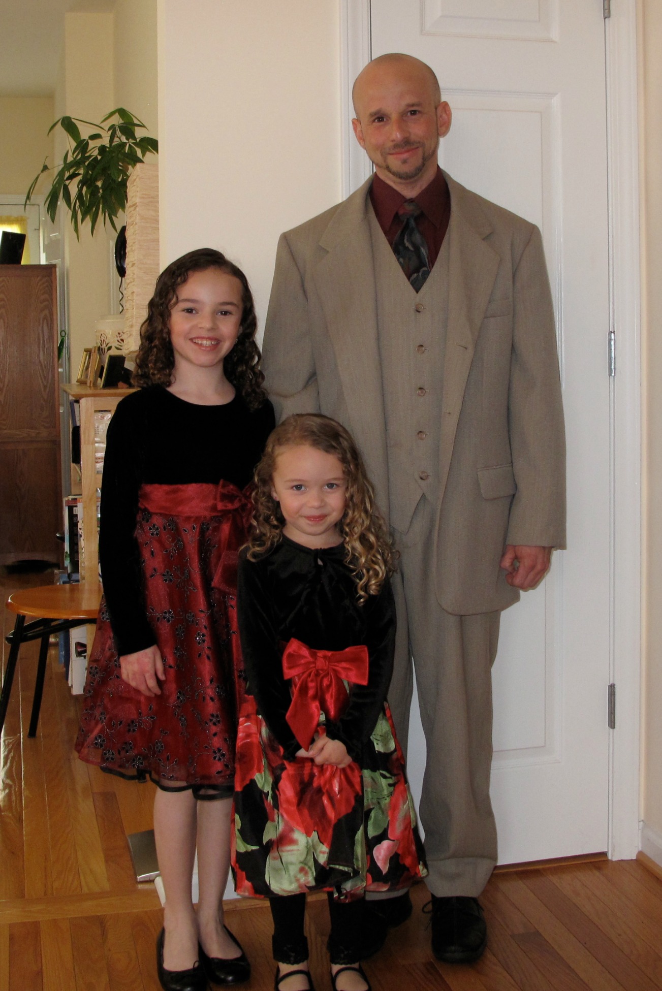
I'm not sure when it happened, but somewhere in the last year or two, my eyes were upgraded. Now, I don't mean my actual vision upgraded. I still wear the same prescription contacts. I mean that my ability to recognize what looks good, versus what looks like crap, has greatly improved. For example, I recently saw an old picture of myself wearing a suit (Disclaimer: When I say "old", I'm talking about 3 years ago). At the time of said "suit picture", I really thought this suit looked snazzy on me, despite desperate pleas from my sister and mother to avoid wearing it, at all costs. They said, "It's way too big for you, man", but I failed to really see it.... until the other day. We were going through old pictures and , low and behold, there it was - the GIANT SUIT! "My God", I proclaimed, as I laid my eyes on myself, wearing what must have been assumed by others as my much larger uncle's hand-me-down. "Holy ****! Please tell me you photoshop'd this" I asked my mother, reaching for hope. What on earth were these other parents at the Daddy-Daughter Dance thinking? Did they feel sorry for me? Were they secretly laughing at me when I wasn't looking? Were they talking about collecting donations to help the poor homeless man that made it to his child's dance? Thank God my daughters weren't old enough to be utterly embarrassed at their oversized-suit-wearing father!
The same thing recently happened when I started reviewing my Squarespace website, with plans of a new template and redesign. Horrible color combinations, low resolution super pixelated images, sloppy formatting of blocks, cluttered information... Gosh, did I really think, "This looks great!" at one point? It's like I was operating with a completely different set of eyes! It all looked incredibly unprofessional and ugly, which is not the image you want to present yourself with - especially when Videography is one of the skills you're claiming.
A solid, well formatted, easy to navigate, visually appealing website is not only a good idea - it is MANDATORY, if you want your site to represent you as the best in your field. When I dove into the template options Squarespace offers, and started viewing sample sites within these template designs, it was clear to me that much work had to be done. Luckily, with Squarespace, converting to a new template design is super simple and doesn't require starting over from scratch.
After several weeks of adding, subtracting, tightening up, and tweaking, I can't believe the difference in the look of the old site versus the new. It's SO much better, and I give all the credit to my new upgraded eyes, and to Squarespace for offering such an amazing product for so little. Where else can you get a website like this for ten bucks a month?
I would LOVE to hear your thoughts on the new website and ANY constructive criticism is more than welcomed. I'm sure my eyes still have several perception upgrades on the way!


